Changing Letter Style in CSS

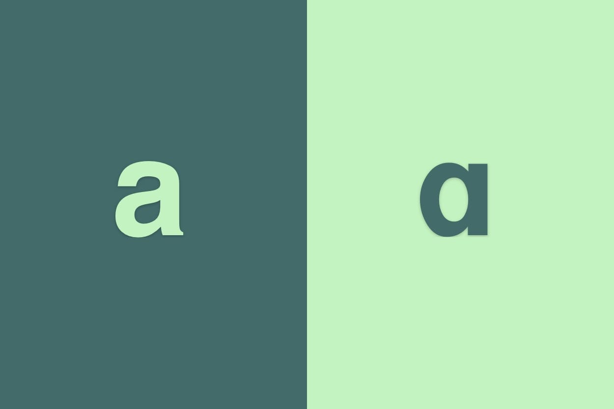
You know the two types of ‘a’, right? The one with the hook up top, like a rotated e, and the other one thats more circular. I did, but it had never crossed my mind that a typeface (or CSS font-family) can provide both and we can actually choose which one we’d prefer!
So there are two forms of the lowercase letters a and g: the single-storey (or one-storey) and the double-storey (or two-storey). Single-storey is the letter we all learnt to write at school. Double-storey is the more Roman typestyle. If you’re still not following, see an example on Creative Pro’s TypeTalk.
There’s not a huge difference, but there may be cases where it’s important to use either one or the other. How do we do this in CSS, I hear you ask. Well, it’s a little CSS style called ‘font-feature-settings’!
body {
  font-feature-settings: 'salt' on;
}
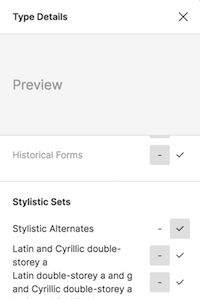
I think the ‘salt’ stands for ‘stylistic alternate’ and it will likely depend on your typeface as to whether or not this will work for you. Searching for what ‘salt’ meant, I found another blog that talks about working with alternate characters that I wish I’d found 2 hours ago! I found this from the code part of Figma after changing the setting there.

As you might imagine, CSS Tricks has a great article about font-feature-settings with a nice list of other possible values. But for me, it was Figma that showed me the way! Have fun.


Comments